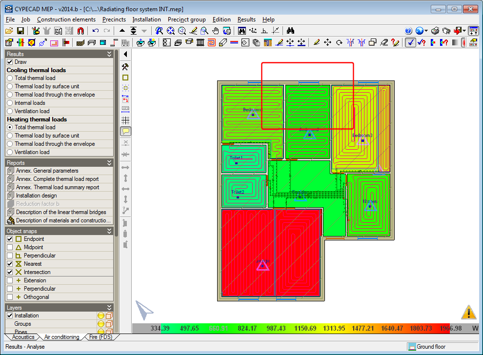
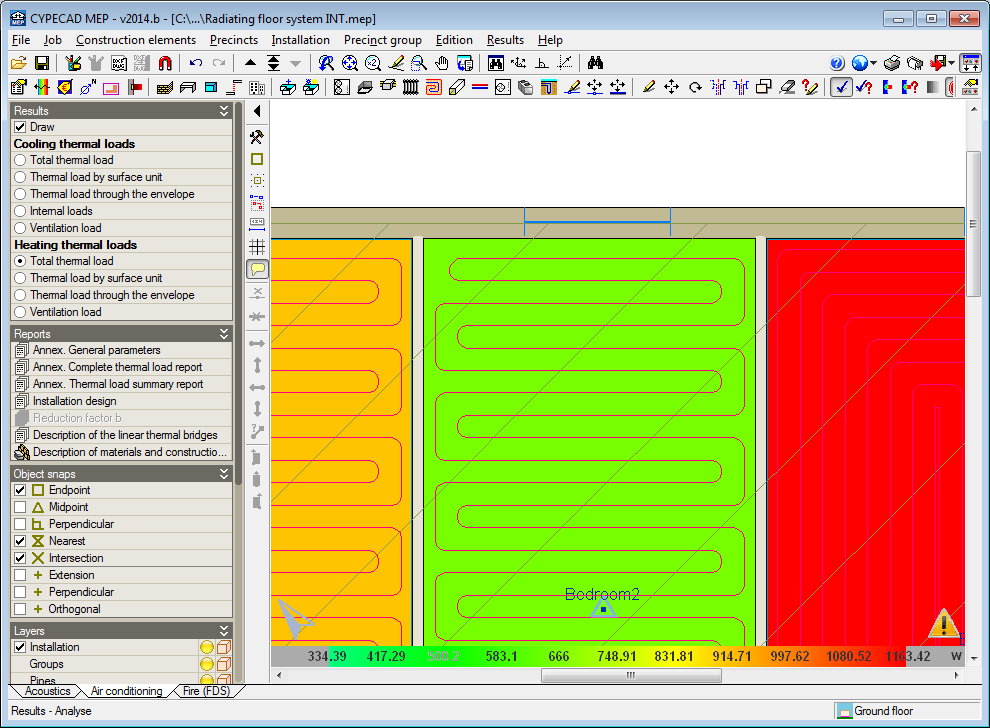
The 2014.b version includes a practical and important new feature which allows users to know the thermal loads of the precincts of a floor of the building at a single glance. It consists of a display, using contour lines, of the heating and cooling thermal loads that have been calculated for each precinct.
Once the analysis has been carried out in the Air conditioning tab, users can activate the Draw option, within the new Results section in the lateral menu. By activating this option, the data that can be represented on-screen related to the heating and cooling thermal loads is displayed:
- Cooling thermal loads
- Total thermal load
- Thermal load by surface unit
- Thermal load through the envelope
- Internal loads
- Ventilation load
- Heating thermal loads
- Total thermal load
- Thermal load by surface unit
- Thermal load through the envelope
- Ventilation load
The thermal cooling or heating loads can be selected if they have been activated for the analysis in the Load calculation section of the General data dialogue box (Job > General data). The “Air conditioning” option in this dialogue box activates the analysis of both thermal loads and the “Cooling” and “Heating” options only activate the loads their name indicates.
The external, inhabitable, or habitable precincts for which the option “Not air conditioned” has been activated, will appear in white when either the cooling or heating thermal loads are selected. Habitable precincts, whose design parameter for the thermal analysis has the option “Only heated” activated, will appear in white when any type of cooling thermal load has been activated.
As with any data representation carried out by CYPE programs using contour lines, a scale of values of the colours that are displayed is present in the bottom part of the screen. The colour range used in the representation can be changed using either of the two colour palettes in the Colours for the representation of contour maps dialogue box (“General configuration button ![]() ” located in the top right-hand corner of the screen > “Colours for the representation of contour maps” option). The palette with least colours allows for the texts to be visualised better on-screen, although the precincts may be represented with colours which are similar to each other. The palette with most colours may hinder the reading of some texts on-screen but the precincts are represented with a more varied colour range.
” located in the top right-hand corner of the screen > “Colours for the representation of contour maps” option). The palette with least colours allows for the texts to be visualised better on-screen, although the precincts may be represented with colours which are similar to each other. The palette with most colours may hinder the reading of some texts on-screen but the precincts are represented with a more varied colour range.
The maximum numerical value that is visible on-screen always corresponds to the colour at the right-hand end of the selected palette and the minimum value with that at the other end. This allows the precincts which are represented on-screen with similar colours to change and so can be better distinguished between one another upon zooming in.


