Top toolbar
The toolbar containing the quick-access tools for the Report Template Editor is located at the top left of the interface, below the main menus.
The tools available vary depending on the section you are editing.
General tools
The general toolbar brings together the options used to create, edit and configure the objects in the template.

It offers the following options, divided into four sub-groups:
Editing and organisation
- Table mode
Work with the tabular layout of the template elements. Its settings can be changed via "File > Configure > Table mode", where you can set the spacing between columns and the minimum spacing between rows.
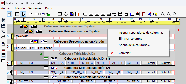
When the tool is activated, you can access a context menu by clicking on the horizontal or vertical rulers in the editing area. From this menu, you can insert or remove column separators, delete columns or adjust their width.
- Tool for creating rectangles and lines for tables
This makes it easier to create rectangles and lines to organise tables visually within the template areas.
- Pointer
This is the main tool for editing the template graphically. It allows you to:- Edit objects by double-clicking on them to access their properties.
- Move objects, click and hold the left mouse button, then drag them into the area in which they have been defined. As an exception, the vertical lines and rectangles in the two areas of the page’s inner mask can be moved between areas and may even appear in both.
- Select multiple objects using a selection rectangle. If you draw it from left to right, only objects that are completely enclosed within it are selected; if you draw it from right to left, objects that are only partially enclosed are also selected.
- Copy the selected objects simultaneously. If you hold down the key
Ctrlwhilst moving, a copy is created at the new position. - Change the dimensions of alphanumeric objects by adjusting their edges or ends.
- Adjust the height of rows and zones by moving their boundary lines.
- Change the design width of the template by moving its right-hand edge. The programme does not allow this width to be reduced beyond the limit set by the right-hand edge of the object that protrudes furthest in the template.
- Access the context menus for sections and areas via their title bars.
Alphanumeric objects
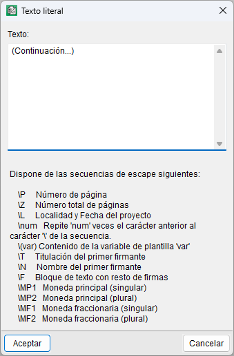
- Literal text
Insert fixed text, consisting of one or more lines, into the template.
To create it, select the tool and draw the area on the line where the object will be placed. A window will then open in which you can define its content.
The text may include escape sequences to insert specific characters or special behaviours. For example, the total number of pages \Z, with the content “Page \P of \Z”. If the content spans several lines, the object must be configured as multi-line so that all lines are printed in the list.
In the editor, these objects are highlighted with a grey background.
- Template or storable variable
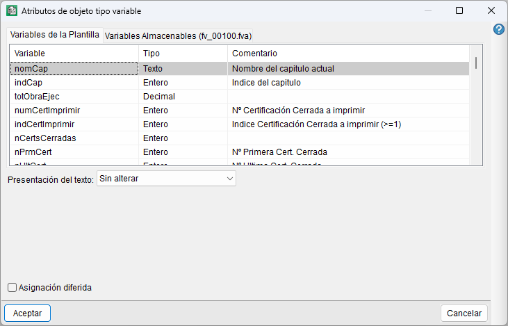
Display the content of a template variable or a storable variable to be displayed.
To create the object, you define the space it will occupy and then select the associated variable and its display mode, which depends on the data type. The content displayed corresponds to the value of the variable at the time the report is generated.
In the editor, these objects are highlighted with a red background.
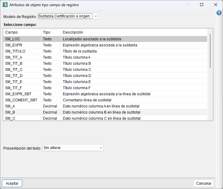
- Record field
Display the contents of a field from the record template associated with the section to which it belongs or with a preceding section.
To create the object, you define the space it will occupy and then select the record template, the field and how it is to be displayed.
In the editor, these objects are highlighted with a blue background.
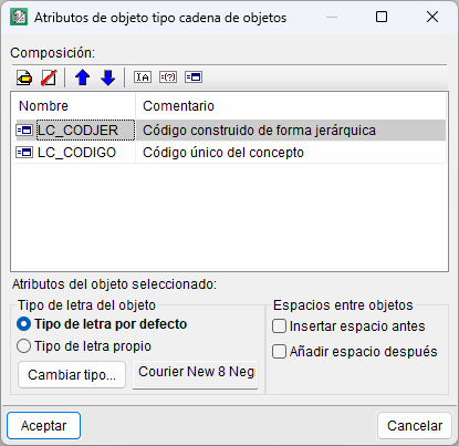
- String of literals, variables and fields
Combine two or more literal texts, variables and record fields into a single alphanumeric object. The resulting content is generated by concatenating the values of the different objects that make up the string.
To create the object, you first define the space it will occupy and then select its composition. Its settings allow you to add, remove and reorder the elements, as well as define their font and the spacing between them.
In the editor, these objects are highlighted with a green background.
Graphic objects
- Orthogonal line (Vertical/Horizontal)
Create vertical or horizontal lines on the template, depending on the direction in which you drag the cursor. Once the line has been created, you can define its attributes, such as the line thickness and colour.
- Rectangle
Create rectangles in the template by drawing their outline on the line. Once created, you can define their attributes, such as the line thickness and colour, as well as set a transparent background or a coloured fill.
- Circle/Ellipse
Create circles or ellipses on the template by using the cursor to define the area they will occupy. If you draw a rectangular area, an ellipse is created; if the area is square, a circle is created.
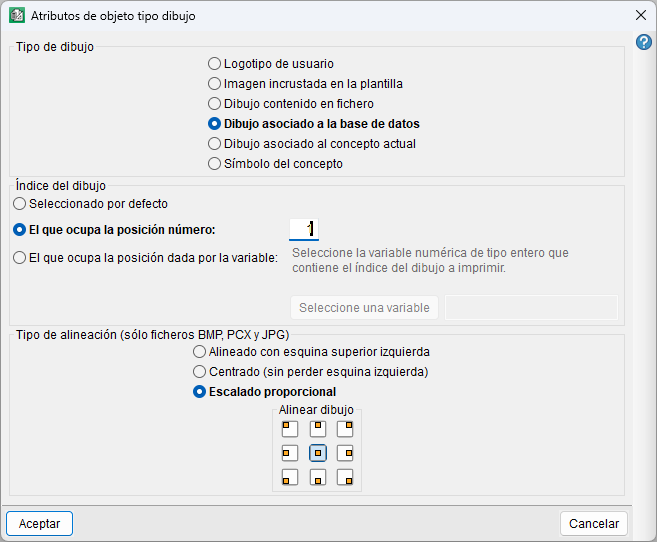
- Drawing
Insert images or drawings into the template, having first defined the area they will occupy.
The drawing may be a user logo, an image embedded in the template, a graphic file, a drawing linked to the database or the current concept, or the concept’s symbol. It also allows you to select the drawing by its index and configure its alignment or scaling within the defined space.
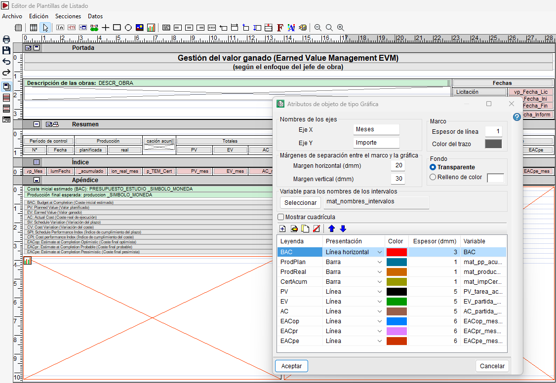
- Chart
Insert charts generated from data stored in variables within the template.
To use this tool, you must first have a text array variable, which is used to define the names of the intervals.
To create the object, you first define the space it will occupy and then configure its attributes. These attributes include the names of the X and Y axes, the margins, the frame and background properties, the variable used for the interval names, and the grid display. It also allows you to define the data series to be plotted, specifying for each one its legend, presentation, colour, line thickness and associated variable.
Alignment and adjustment of objects
- Link with multi-line objects
Set the vertical alignment of an object relative to a reference multiline object on the same line.
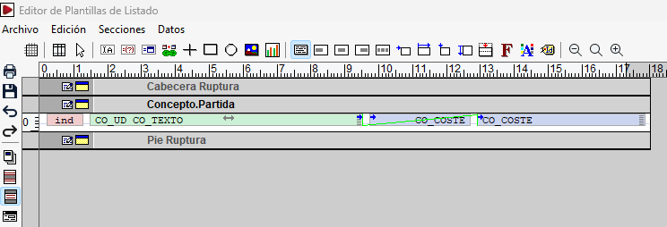
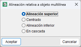
To create the link, with the tool selected, left-click on the object you wish to link and then on the multiline object that will serve as the reference. After selecting the second object, a window opens to choose the alignment, which can be top, centre, bottom or cascade. This last option is available when both objects are multiline. By default, the alignment is top.
The link can be removed by selecting the tool again, clicking on the linked object and then on an empty space.
- Align text to the left
Align the content of an alphanumeric object with its left margin. To apply this, select this tool and then click on the object you wish to modify. This is the default alignment for most alphanumeric objects.
- Centre text
Centre the content horizontally within the width defined for the object. To apply this, select the tool and click on the relevant alphanumeric object.
- Align text to the right
Align the content with the right-hand margin of the object. To apply this, select the tool and click on the object you wish to modify. This is the default alignment for numeric fields and variables.
- Justify text
Distribute the text across the margins of the object, adjusting the spacing so that it fills the entire width. To apply this, select the tool and click on the alphanumeric object. In multi-line objects, justification is not applied to the last line or to lines ending with a line break.
- Horizontal object movement
Adjust the horizontal position of an object to fit the available print width.
To apply this, select the tool and click on the object; then define the proportion used to calculate its displacement.
Objects with this attribute enabled are indicated by a blue arrow in the top-left corner.
- Horizontally resizable object
Increase or decrease the width of an object to fit the available print width.
To apply this, select the tool and click on the object to set the percentage by which its width will change.
Objects with this attribute enabled are identified by a blue arrow in the top right-hand corner.
- Mobile object in vertical direction
Adapt the vertical position of an object to changes in height within the area, for example, where there are multiline objects.
To apply this, select the tool and click on the object to set its vertical offset.
Objects with this attribute enabled are identified by a blue vertical arrow on the left-hand side.
- Extensible object in vertical direction
Adjust the height of certain graphic objects, mainly vertical lines and rectangles, to fit the height of the area.
To apply this, select the tool and click on the object to set the variable height attribute. In certain cases, such as areas containing multiline objects, the programme may apply this adjustment automatically.
- Half-line displacement (quantity tables)
Apply a vertical displacement equivalent to half a line to an object during printing.
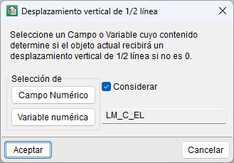
To configure this, select the tool and click on the object, specifying the field or variable whose value will determine the displacement. The displacement is applied when that field or variable contains a numerical value other than zero. This option is particularly useful in quantity tables containing expressions that generate line spacing.
Objects with this attribute enabled are identified by a red arrow at the top centre.
Format and display
- Font
View and change the font used for alphanumeric objects in the template. With the tool active, you can apply changes to a specific object, a row, a zone, a section or the entire template.
When applied to an alphanumeric object, the characteristics of the font used are displayed, and you can select a different one or create a new one. If applied to a row, area or section, you can change the default font – which will be used when creating new objects – or apply the new font to all existing objects within that area as well. Similarly, you can apply changes to the entire template by clicking on the top ruler.
The list of available fonts, labelled "Font", will depend on the fontstruetypeinstalled on your system.
- Colour palette
Change the colour of objects in the template. To do this, select the tool, choose a colour from the palette and click on the object you wish to change. The "More colours" option allows you to select additional colours.
- Object ID
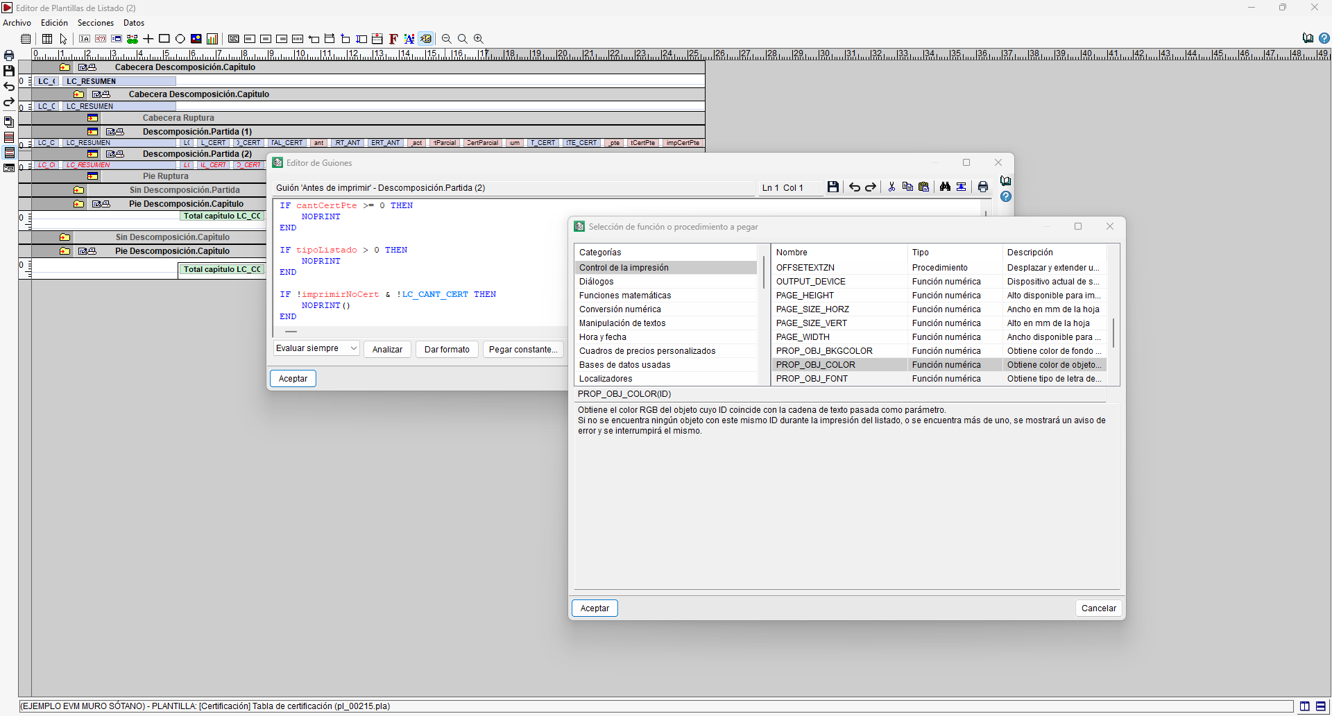
Assign or modify the identifier (ID) of an object, which can then be used to reference it from the template scripts.
To do this, select the tool and click on the relevant object to enter or edit its identifier.
This ID can be used as a parameter in certain functions and procedures within the scripting language to retrieve or modify the object’s properties, such as its colour, font or other attributes.
- Zoom (-)
Reduce the size of objects in the workspace.
- 100%
Reset the zoom level to its default setting and displays the current percentage and the percentage to be restored (100%).
- Zoom (+)
Enlarge the objects in the workspace.
Tools in the "Dialog boxes" section
When working in the "Dialog boxes" section, the toolbar changes to display the specific options used for creating and editing dialog boxes.

The following options are available:
- Pointer
Select, edit, move and modify the elements in the dialog box. It works in the same way as the "Pointer" tool used elsewhere.
- Literal text label
Insert fixed text into the dialog box, used, for example, as labels or prompts to identify the information requested from the user. To create one, select the tool and draw the area on the line where the object will be placed. A window then opens in which you can define its content and the text style.
- Variable edit box
Insert an editable box into the dialog box that is linked to a variable or a modifiable field, so you can enter or change its value when the dialog box appears whilst the report is being generated. When you create it, you can select:- Use variable. Link the box to a template variable or a storable variable.
- Use an editable field. Link it to one of the database fields that can be edited and, where applicable, specify the number of lines in the box.
- Check box
Insert a selection box linked to a template variable or a storable variable. Its status allows you to modify the value of the associated variable when the dialog box is used during the generation of a report. When creating it, you select the associated variable and can define the text that appears alongside the checkbox.
- Option group
Include a set of options linked to a variable, from which one can be selected whilst using the dialog box. The first option assigns the value 0 to the variable, the second the value 1, and so on. When creating this, select a variable from the template or a storable variable, and enter the text for the options, one per line.
- Selection box
Include a list of options linked to a variable, from which a value can be selected whilst using the dialogue box. The selected option determines the value assigned to the associated variable. When creating it, select a variable from the template or a storable variable and enter the text for the options, one per line.
- List
Include an organised list in one or more columns within the dialogue box. Each column is linked to a matrix variable, the values of which are displayed as items in the list. When creating the list, you can specify the number of visible rows and configure the columns by entering their title, the associated array variable and whether their content will be editable. You can also add, remove and reorder the columns.
- Button
Add a button that acts from within the dialog box. When creating it, you define the text displayed on the button and the dialogue box or user procedure that will be executed when it is clicked. It also allows you to specify the title of the dialogue box that will be displayed when the action is performed.
- Horizontal line
This allows you to insert a horizontal line to visually separate the elements of the dialogue. When creating it, you can choose between a thin line and a thick line.
- Test dialog box
This allows you to check the appearance and behaviour of a dialogue box whilst designing it. To use this feature, select the tool and then click on the dialogue box you wish to test.
- Viewing tools
These include the same options – ‘Zoom (-)’, ‘100 per cent’ and ‘Zoom (+)’ – as those available on the general toolbar.